
ChatGPT for Data Analysis: A Beginner's Guide
Create beautiful visualizations with ChatGPT's Advanced Data Analysis Tool

Most of us think of ChatGPT as a conversational chatbot. However, ChatGPT is also a comprehensive data analysis tool that can handle various data file formats, including Excel spreadsheets, CVS files, PDFs, and even JSON files.
In fact, this paper found that ChatGPT achieves comparable performance to humans in various data analysis tasks. At the same time, it was much faster and over 200 times cheaper than a senior data analyst!

In this guide, I am going to show you how to use ChatGPT to perform several data analysis tasks in minutes without coding experience or expensive statistical software. After uploading your data, you can use simple conversational prompts to clean, transform, and visualize your data.
Summary
We will use data from the latest World Happiness Report to:
Create visualizations like bar charts, line graphs, boxplots, and heatmaps.
Analyze trends over time, between countries, and across different variables.
Perform regression analysis and even explore predictive modeling, including more advanced methods like latent profile analysis.
The guide will also include tips on how to make your outputs more consistent and visually appealing.
Uploading Multiple Files
You can upload up to 10 files in a single conversation, which means you can bring in multiple datasets and have ChatGPT help you compare or merge them seamlessly.
Limitations
Before we start, it’s important to emphasize that the Advanced Data Analysis feature is still experimental. It might sometimes get confused, produce incorrect statements, or introduce numerical errors (all this is common for LLMs). Therefore, to get the best results, always verify the output carefully. When creating visualizations or models, you might need to adjust the prompts a few times to ensure everything looks correct and makes sense.
Also, the “View Analysis” feature allows you to see the underlying Python code ChatGPT used to create the output. This is a great way to verify the steps taken and to double-check calculations. You can also ask ChatGPT to provide downloadable program files or new transformed datasets so that you have a record of all modifications made.
How to Enable the Advanced Data Analytics Tool
Advanced Data Analysis is available to ChatGPT Plus users ($20/month). To access it, simply log in to ChatGPT, start a new chat, and upload your data files. The ADA feature will activate automatically, recognizing when you want to perform data analysis.
Using Specialized GPTs
While you don’t need to do anything to use the ADA feature, ChatGPT has a specialized “Data Analyst” GPT developed by OpenAI. This GPT is specifically fine-tuned for data analysis tasks. To use it, click on “Explore GPTs” in the top left corner, then select the data analyst GPT before starting your analysis. I will use the Data Analyst GPT for the analysis below.
How does the Advanced Data Analysis feature work?
Upload Your Data: Upload your data files through ChatGPT’s chat interface. Click on the "+" button in the chat to attach your files or drag and drop them.
ChatGPT Analyzes the Data: ChatGPT processes the data using a Python environment. It uses well-known Python libraries like Pandas for data manipulation and Matplotlib for creating visualizations.
Provide Instructions: Use natural language to provide instructions. You can ask ChatGPT to clean data, create specific charts, or run analyses, all without needing to code.
Results in Real-Time: ChatGPT converts your instructions into Python scripts, runs the code, and presents the results in accessible formats like tables, charts, or statistical summaries.
For the best results, make sure you are using structured data, with rows and columns properly labeled. Adding a description of each variable in a second row can help ChatGPT understand your dataset better, which can improve the quality of the analysis (although, it’s not necessary).
Iterative Analysis
The best part about using ChatGPT for data analysis is that it’s iterative. Once you get an initial output—like a chart or a summary—you can tweak it instantly. Want to add more countries to a graph? Change colors? Add new annotations? Just ask! You will see the changes made in real-time, making it an easy and efficient way to explore your data.
Let’s get started with the practical example.
The Dataset
For this exercise, we will use a dataset from the latest World’s Happiness Report that covers country level happiness trends from 2008 to 2022 [download the data here].
Click on the button in your chat window (lower left corner) and upload the happiness data file (or just drag and drop the file).

Now you are ready to interact with the data using simple natural language prompts.
Dataset overview
If you are not familiar with the dataset, you can start by exploring its structure. You can ask ChatGPT to read in the data, describe it, clean it for null values, and transform it. Our dataset is already in the desired format, but there are missing observations, so we can ask ChatGPT to delete them. Here are some sample prompts to get you started.
· Please analyze the data file and give a description of all variables.
· Show me the first few rows of the dataset.
· Generate summary statistics table, showing the mean, standard deviation, and number of observations for each variable in the dataset.
· Generate histograms for happiness, GDP per capita, and life expectancy to understand their distributions across all countries.
Here are some of the results. ChatGPT described the variables and created some histograms.

Color Scheme
ChatGPT’s creates Python code in order to create visuals. The process can be somewhat random. Therefore, if you are looking to produce consistent graphs, it may be helpful to pick a color scheme. Here are some colormaps you can use. I will be using some of these color schemes in the examples below.

Or you can slice them down further. Here is the spectral color map sliced into 5 (with some hex codes below).

'#5cb7aa', '#97d5a4', '#fff1a8', '#fa9b58', '#ee6445'
Note on Accuracy
It’s important to check the accuracy of the output. While advanced (and better than most people), the system can produce misleading output. Asking ChatGPT to work step by step, explain the output, and double check the work is a great way to force it to produce more accurate output.
Additionally, you can click on show work to see the underlying Python code the system uses to produce the results. This allows you to see all the steps the system takes to produce the output. You can also ask the system to provide you with a downloadable program file or for newly transformed and cleaned dataset.
Time Series Analysis
Ok, let’s start by looking at happiness trends over time.
Global Happiness
First, let’s look at global happiness over time. Note that there is no variable in the dataset that measures global happiness. GPT-4 will automatically do the task and then create the graph.
Plot a line chart displaying global average happiness from 2008 to 2022, with a trend line to highlight overall changes. Use the following color for the happiness line: #5cb7aa & this color for the trend line: #ee6445. Make sure to start at 2008.
There is a slight increase in happiness from 2016 and 2020 and then a drop, likely due to the covid-19 pandemic. But the overall trend is positive.
Next, let’s look at some country-specific happiness trends over time.
Generate a line chart showcasing the happiness of the United States, United Kingdom, Bulgaria, Afghanistan, and Finland from 2008 to 2022. Use different colors for each country. Specifically, use the color scheme spectral picking more vibrant colors.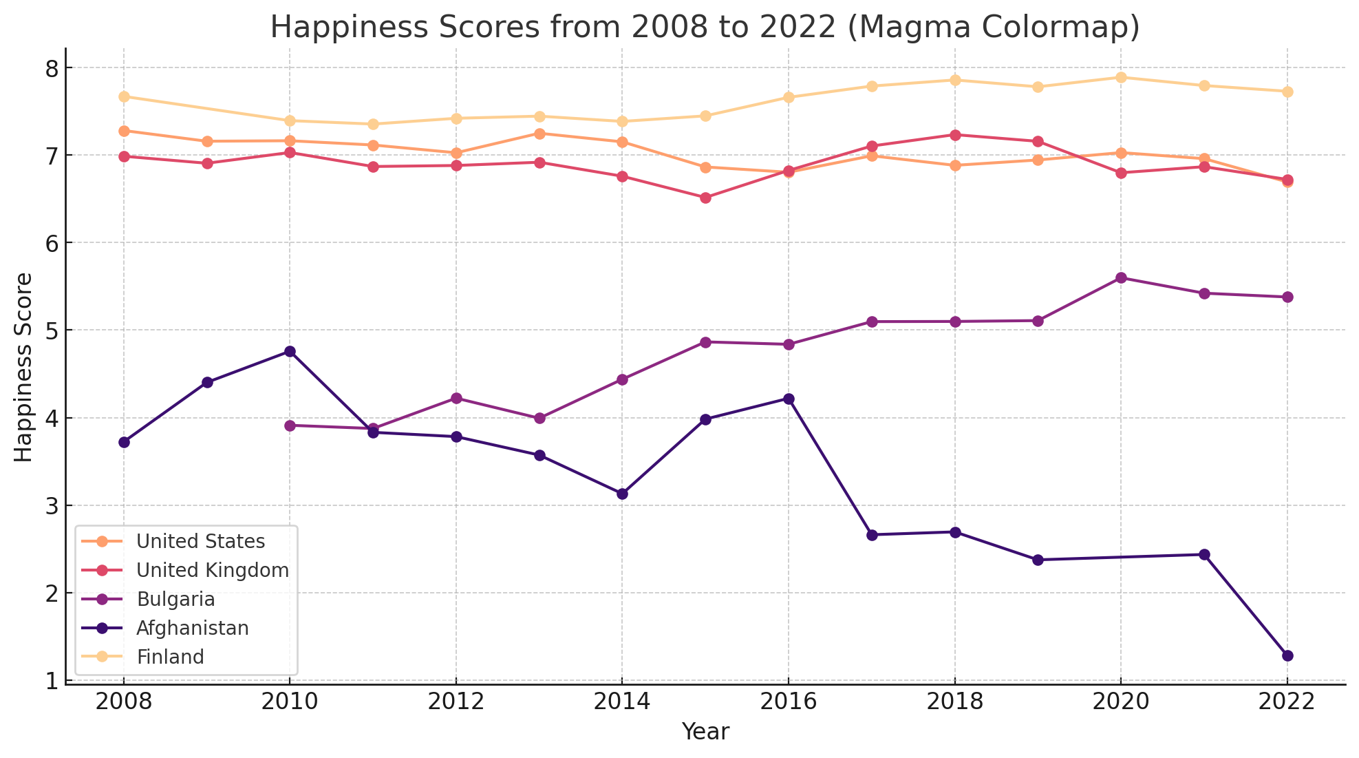
Changes over time
Next, we will look at the countries that experienced the largest happiness changes over the same period of time.
Create a bar chart to show which countries experienced the largest changes in happiness scores from 2008 to 2022. Show me the top 10 and bottom 10 in terms of increase and decrease in happiness. Put the country with the highest happiness increase on the top of the graph and the one with highest happiness decrease at the bottom. Use the following color for increase (#5cb7aa) and decrease (#ee6445). Thanks!
Heatmap chart
We can even represent country specific trends with a heatmap.
Generate a heatmap chart for the United States, Afghanistan, Costa Rica, Bulgaria, and Finland from 2008 to 2022. Put year on horizontal axis and countries on the vertical one. Use the color scheme spectral. Put happiest countries on top and less happy on bottom. Thanks!Generate box plots
We can also generate a box plot that can allow us to see the distribution of happiness scores over time and help us identify outliers.
Generate box plots to explore the distribution of happiness scores for each year. Use the color scheme spectral. Thanks!
Cross Country Analysis
Next, let’s look at the distribution of happiness around the world.
Comparing happiness across countries
First, we will compare happiness levels across different countries.
Generate a bar chart showing the top 10 happiest countries in 2022 and the bottom 10 least happy countries. Put countries on the vertical axis and happiness levels on the horizontal one. Make sure the happiest countries are on the top and all countries are in descending order (e.g., happiest country is at the very top of graph, least happy country is at the bottom). Use the color scheme spectral. Put a legend on the right hand side of the graph. Thanks!
I decided to ask ChatGPT to include countries in the middle of the happiness distribution. And add dashed lines and labels for the top 10, middle 10, bottom 10 to create a bit more separation. After a couple of prompts, here is the final result (it took about 3 mins to do this task).

Can you do the same chart but for all European countries? Use the color scheme spectral again. Thanks!
Generate a choropleth map
Now, let’s try to visualize happiness on the world map.
Can you please create a choropleth map showcasing happiness levels of all countries in 2022.Here is what the first iteration of the map looked like.
It couldn’t match all the countries with the GeoJSON file it was using. So, I simply asked it to match the countries with geoJSON dataset and then create another map, also fixing the map and legend to have better proportions. Here is the next iteration of the map.

You can also ask ChatGPT to create a map that shows relative changes in happiness over time.
Great! Now would you do one more map. Can you analyze the data from 2008-2022 and create a choropleth map that shows how much each country has changed over this period of time (to show more or less happy). Please adjust the map to account for any outliers.Create a spider chart
We can even get creative and ask ChatGPT to create a spider chart for individual countries and then compare them.
Can you generate a spider chart for Bulgaria for 2022. Use the dimensions of happiness, log gdp per capita, social support, healthy life expectancy, freedom to make choices, perceptions of corruption. Standardized each variable so the chart looks more consistent. Make the chart visually appealing (and more modern looking). Use the color scheme spectral. Thanks!
Correlation and Regression Analysis
Next, we will explore the relationships between different variables and build a simple model to understand the determinants of happiness.
Explore the relationship between $ and happiness
Let’s create a scatterplot so we can visualize the relationship between money and happiness.
Can you create a scatter plot that shows the relationship between GDP per capita and happiness. Use X for each country (make the X different color based on the level of happiness). Fit an OLS line that shows 95% confidence interval and display it on the graph. Make the confidence intervals light gray with medium level of opacity. Use the color scheme magma. Thanks!
One cool thing is that the process is iterative. So here is the same graph with a different color scheme and for 2022 only.

And adding country names.

Let’s do the same with all other variables in the dataset (gdp per capita, social support, healthy life expectancy, freedom to make choices, generosity, perceptions of corruption). Combine all graphs into a single 2 (columns) x 3 (rows) figure.Run a linear regression model
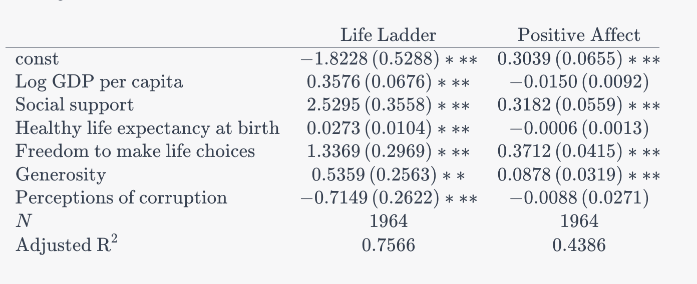
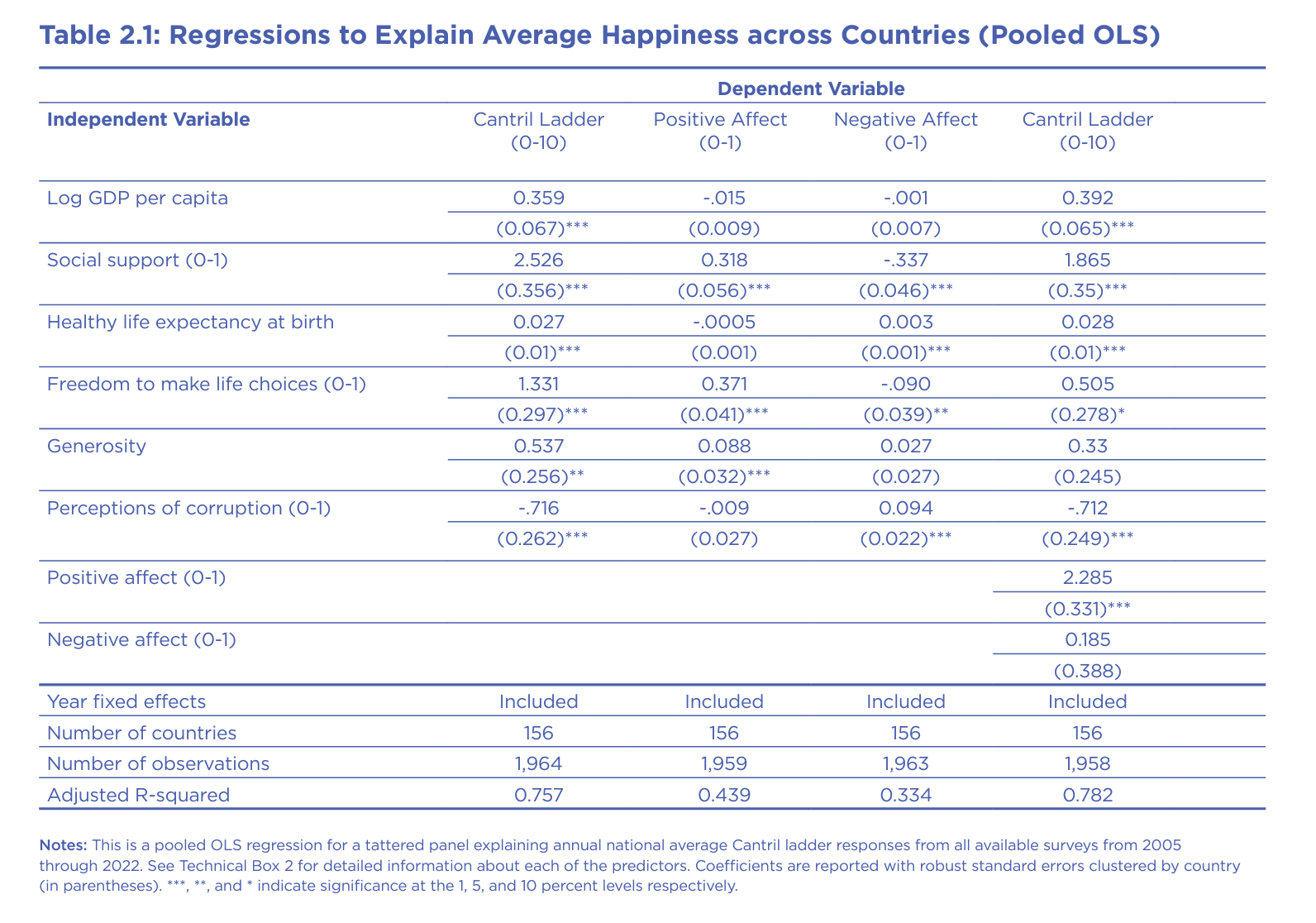
Next, we will replicate figure 2.1 from the World Happiness Report.
Can you run a pooled OLS regression explaining happiness from all available surveys through 2022. Use happiness as a DV and log gdp per capita, social support, healthy life expectancy, freedom to make choices, generosity, perceptions of corruption as controls. Include year fixed-effects. Report all coefficients in a table with the title: Regression to explain average happiness across countries. Coefficients are reported with robust standard errors clustered by country (in parentheses). ***, **, and * indicate significance at the 1, 5, and 10 percent levels respectively. Report number of countries, number of observations, and adjusted R-squared. Thanks!Here is some of the output, which is identical to the figure in the World Happiness Report. You can also ask ChatGPT to export the result into an Excel file or create the table for Latex, which you can edit further. The important thing is that it replicated the OLS model quite accurately.
Based on the results which factor is the most important for happiness at the country level? How did you figure this out? Can you create a graph that shows the relative importance of each variable for happiness? Exclude year fixed-effects. Use the color scheme magma.

Can you run a regression model explaining happiness from all available surveys through 2022. Use happiness as a DV and log gdp per capita, social support, healthy life expectancy, freedom to make choices, generosity, perceptions of corruption as controls. Include country and year fixed-effects. Based on the estimated model, can you show a graph with the predicted happiness vs actual happiness for the United States. Thanks!
Latent Profile Analysis (Advanced)
Next, let’s try a more advanced technique such as latent profile analysis (LPA), which is a statistical method used to identify subgroups or profiles within a larger population based on observed variables. LPA assumes that there are a few latent (unobserved) subgroups in the population, and people within each subgroup share common characteristics that differentiate them from other subgroups.
An example would be a study looking at the emotional health of college students. You can measure variables like depression, anxiety, self-esteem, and life satisfaction. LPA on these variables may identify three latent profiles: a “healthy” group with low depression/anxiety and high self-esteem/life satisfaction, a “moderate distress” group with moderate scores on all variables, and a “distressed” group with high depression/anxiety and low self-esteem/life satisfaction. The profiles represent subgroups of students with distinct emotional health experiences that aren't directly measured but are inferred through the observed variables.
You can apply LPA to identify subgroups of customers with different preferences and behavior that can allow targeted marketing strategies. Or you can detect subgroups of investors who make decisions based on distinct goals and risk-tolerances to support financial advisory, and so on.
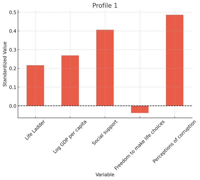
Perform a latent profile analysis (LPA) using data on the following variables for all countries in our dataset: happiness score, GDP per capita, social support, freedom to make life choices, and corruption perception index. The goal is to identify clusters of countries that share common profiles across these variables. Select the optimal number of latent profiles –when doing this marginal improvements in the model (show a graph). Validate the resulting model by examining the entropy, average latent class probabilities, and odds of correct classification. Report the centroid values (variable means) for each profile and the number of countries assigned to each. Visualize the profiles of each cluster using bar charts, highlighting the average levels of each factor in each cluster (use the standardized values here). Create separate graphs for each profile. Use color scheme spectral for all graphs. Take a deep breath and work step by step. Thank you!ChatGPT picked three profiles, which seems reasonable (the gain beyond three profiles is only marginal).

And here is a breakdown of the profiles. Countries are not the best application of LPA, but the idea is that you can do this type of exploratory analysis relatively well.

Overall, the analysis found 3 distinct profiles. As you would expect, one profile reflected lower well-being and economic development. Another one moderate well-being and economic development. And the final one high well-being and high level of economic development (as well as low level of corruption perceptions).


Machine Learning (Random Forest Model)
Next, we will fit a basic machine learning model (random forest) to predict happiness scores. This is not meant to be exhaustive and some basic understanding of the method is required, but to demonstrate the capabilities of ChatGPT.
· Train a random forest model to predict happiness. The predictors should include GDP per capita, social support, freedom to make life choices, corruption index, and year fixed-effects. Use 70% of the data for training, 20% for validation, and 10% for testing model performance. Show how well the model performs. Evaluate the importance of each variable (show a graph with relative importance of each factor). Complete the analysis without stopping. Make whatever assumptions you need to make.

· Based on the estimated model, can you show a graph with the predicted happiness vs actual happiness for the United States. Thanks!
Interactive Dashboard (Advanced)
Finally, we can even create an interactive dashboard to visualize the dataset using Python and Streamlit.
· Use tools like Plotly, Dash, or Streamlit to create an interactive web application.
· Include various types of plots and allow users to filter and interact with the data.
· Incorporate user input to dynamically update visualizations.
Exploratory Data Analysis
Finally, even if you don’t know where to start, you can simply ask ChatGPT to explore the data on its own and find some interesting or counter-intuitive patterns. It usually does a great job.
Explore data on its own looking for counter-intuitive patterns
Can you explore the data on your own and look for interesting patterns? What are some counter-intuitive observations, if any? Provide some visualizations to help me understand what you discover.
And, that’s it! Hopefully this guide gave you some good ideas how to use ChatGPT for data analysis. ChatGPT is not perfect, and the best use case is having some background in data analysis so that you can critically evaluate the output. However, when used effectively, it can significantly speed up your workflow, provide fresh insights, and assist in exploring complex datasets. Remember, combining your expertise with ChatGPT’s capabilities can lead to a more efficient data analysis that is also more fun!